I am loving the holidays and time spent with my family. My daughter Audrey (20 yr) is home from college. My son Alex (17 yr)has planned many of our family activities including a wonderful visit to the St. Louis Art Museum to see the special exhibit Action Abstraction. If you live in St. Louis you have until January 11 to see it. It's traveling around the country, so look for it in a city near you.
I love studies in color...and especially abstract art. I can't put in words what it means to me, but it elicits reactions in my soul like when I listen to inspiring music.
I was most moved by Grace Hartigan's work, her story and her art.
Like most women and blacks in the 50s, she had to fight hard for recognition of her work. Hartigan ran in circles of those better known Abstract Expressionists like Pollock and de Kooning. She broke through a glass ceiling in the art world as the only woman represented among 17 artists in the prestigious exhibit "New American Painting" sent by MOMA to Europe to communicate that New York had trumped Paris as the capital of modern art.
I am drawn to Hartigan's use of bold brush strokes and saturated splashes of color.
Bold, abstract, vivid and color infused...I can't get enough of it!
My favorite Hartigan painting is Summer Street (above). Can you make out the woman from the 50s shopping in the street? It took me a bit, but I found her. And do you see the watermelon? What else do you see in the busy summer street? What color and light of summer do you recognize? What time of day does it look like? Are there buildings around and if so, how are they recognized in the painting? Do you see yourself in a street like this?
I wish I could pluck Summer Street off the exhibit wall and place it in Heather's home! Perfect for her piano room (you'll see the reveal of Heather's piano room later on my blog). It would also look great in the 10th Street Lobby (also stay tuned for that reveal.)
I also loved New England in October (below).
Grace Hartigan quietly passed away in November this year. Though she faded from prominence years ago, I am grateful her work lives on in this exhibit.
Dec 28, 2008
Dec 6, 2008
Heather's Dreaming of a Modern Christmas
Modern Christmas tree tea light holder. To view: click here.
Heather, friend and client, is remodling her home, the whole downstairs including entry way, dining room, living room, family room and kitchen. She and her family are embracing contemporary design after many years of living in a traditional space.
Decorating for Christmas this year and coming years may mean revamping or remaking Christmas decorations to complement her new furnishings. So Heather and I have been on the hunt for inspiration in modern holiday design. I came across a variety of things.
For starters, design*sponge has this terrific DIY project to create mod paper ornaments (below). Learn how: click here. These colors might be a bit subdued for Heather's tastes that tend towards bright saturated hues, but she can use any colors to create these. And she can whip out several of these paper gems with the help of her five kids and husband Tom. A great family night project for sure! Best thing, it's not a budget buster.
Make a few for me, please!
How about this glass spiral goodie (below) for a tree topper! Found on Ebay - click here - comes in several colors.
Check out the fun stockings at Bunnie Maxwell (below) and click here. These are Heather's colors!
Found it at the Big Box, yesssss! Target has these trees (below) in red and white -- click here.
A search on Etsy uncovered tons of fun items to inspire.
Like these (below) acrylic ornaments. Click here to see more.
I am loving these felt bobbles found on Etsy -- click here
Heather must have an abominable snowman (below)! What could be more contemporary and contrarian! Also brought to you by Etsy -- click here.
This just may be my personal favorite from Bunny with a Toolbelt - click here. A very contemporary and fun nativity (below). Check out the link for more Christmas designs including ethnic Santas and wisemen in assorted colors and designs.
Heather needs this pillow (below) for her piano room that is done in black, turquoise and green. Found on Etsy - click here.
This ornament (below) reminds me of the complex graphic designs Heather loves. Found on Etsy - click here.
Heather wants to inject more turquoise color in her holiday decor. Here are some I found on Etsy doing a search by color with key words like "ornament" and "Christmas decorations". You can find handmade items in any color by searching the thousands of crafters on Etsy.
Beautiful polymer clay filigree ornament(below) - click here.
Fused glass star ornament (below) - click here.
Trio of trees below - click here.
Turquoise Glass Icicle ornaments (below) and in a variety of colors - click here.
And last, this just looks like something Heather would tuck away some place, even an area of sophisticated decor just to throw you off. Heather is always good for the unexpected startling surprise. Carmen might become part of the family tree, Christmas or otherwise, a new family member. If Carmen paints her nails, she's in! (side note: Heather always paints her nails). See more of Carmen - click here.
Dec 1, 2008
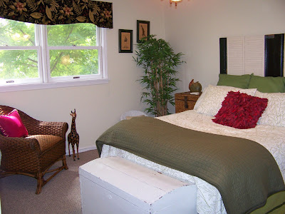
Rebecca's room
I work part-time at Ashley Furniture in Kirkwood Missouri. The most fun part of my job is to learn how customers plan to decorate their rooms. I ask them to send photos of their completed rooms and some take me up on it.
Rebecca and her parents bought the Cottage Retreat bedroom set and designed the room around a Hershey chocolate and bright pink color scheme.
I love the strong colors and dynamic prints in the bedding.
Terrific job...way to go Rebecca!
Labels:
Ashley Furniture,
DIY,
the family in design
Nov 21, 2008
Out of Africa -- Guest Room Makeover
A credenza with items collected from around Carol's home.
Carol recently inherited her mother-in-laws furniture and accessories and was overwhelmed with how to put it all together with the things she already owned. She wanted to keep the old treasures while also creating an updated look. Carol is clever and has an eye for decorating, she just wanted a second eye and helping hand.
Carol's guest bedroom before.
First project: the guest bedroom.
I brought Elizabeth, my assistant decorator-in-creativity to help. Working with Carol, we started with an inspiration piece, actually several. We hunted around the home and found treasures of animals and ethnic pieces that quite naturally set the theme for our room: "Out of Africa".
Carol's Guest room after.
Only thing missing was a headboard.
Carol liked the idea of an antique door turned horizontally to form the headboard, so we headed off to the ReStore to find an old door. Only trouble was we didn't see any we liked. They were either not the right size or color. I suggested we think of something else. Carol saw the shutters...and our minds started turning. Shutters reminded us of a plantation in Africa...OK, so the shutters work, ditch the door idea!
Carol's guest room headboard made of old shutters and baseboard molding found in salvage yard.
Mr.Murphy, one of the helpful volunteers at the ReStore.
Mr. Murphy, who volunteers at ReStore, was so helpful to gather and hold our pieces together so we could view it from a few steps back. We played with white shutters, but they would not piece together to the size we needed. We eyed some black painted baseboard molding pieces and played around until we created a pattern and size we liked.
I love how the black molding works with the white shutters. The black and white headboard works nicely to bookend with the zebra rug Carol placed at the bottom of the bed.
Our headboard cost under $20 for materials. Each average size shutter at ReStore is under $5! I think it looks like much more!
Close-up shot of Carol's headboard.
Stay tuned for more makeovers in Carol's place!
Labels:
Budget Design,
Carol's Makeovers,
Collaborative Design,
DIY
Nov 7, 2008
ABC's Extreme Makeover, Home Edition -- watch this Sunday
l to r, Sara Zigman and Joni Spears, designers who collaborated for the Haven of Grace project. Their children's room is pictured above. Furnishings provided by Zigman, Three Little Ziglets, who also provided furnishings for ABC's Extreme Home Makeover, Home Edition
I have two really good reasons to watch ABC's Extreme Makeover, Home Edition this Sunday.
First, Ashley Furniture Homestore, where I work part-time as a customer specialist,in Kirkwood MO donated the furnishings for most all the rooms in the home.
Second, friend Sara Zigman, whom I first met on the Haven of Grace project, will be one of the featured designers, showcasing her children's room furnishings.
Sara Zigman with her darling handpainted chair.
Learn more about Sara's participation, read her press release:
LOCAL DESIGNER ANSWERS CALL FOR “EXTREME MAKEOVER” FAMILY
ST. LOUIS, MO (September 10, 2008) – St. Louis designer Sara Zigman of Three Little Ziglets answered the call from ABC’s “Extreme Makeover: Home Edition” to help create a dream room for the Martirez family’s 7-year-old daughter. Zigman was contacted late Sunday night by the show’s lead designer, and asked to donate items from Three Little Ziglets’ C’est Chic collection. 30 hours later, Zigman delivered with 15 pieces of custom, hand-painted furniture and a complete set of made-to-order bedding and window treatments.
Once Zigman and five of her artisans worked through the night to complete the request, her work was not done. Zigman was pressed into service on-site at the new Martirez home, painting unique motifs on the walls and helping to stage the adorable room. Three Little Ziglets’ total donation of goods and services total over $10,000.
Named for Zigman’s triplet daughters, Three Little Ziglets’ unique brand of children’s furnishings features hand painted furniture, made to order bedding and movable wall murals. Each collection is designed to grow with children from infancy through the elementary years. Zigman is the winner of recent design awards from Pregnancy Magazine, StyleBakery.com and Metier Magazine. Stylish moms can easily outfit an entire room with one-stop-shopping at the online boutique www.threelittleziglets.com.
Labels:
children's rooms,
Etsy Favorites,
Event,
Making News,
New beginnings
Oct 28, 2008
Audrey Hepburn -- Cousin Craig's newest painting
"People, even more than things, have to be restored, renewed, revived, reclaimed, and redeemed; never throw out anyone."
~Audrey Hepburn~
My cousin Craig just completed his second portrait, this time of Audrey Hepburn and this time in oil.
Audrey Hepburn was such a beautiful person inside and out. I love the above quote, it says so much about her and how we should be.
Oct 23, 2008
More Designing Haven of Grace -- Bird's in flight mural
And drum roll....here is my favorite part of our Haven of Grace project: The Birds in Flight mural -- actually, I don't know if we had a name for it, but I like this name -- envisioned by Gina Adolphson, my partner in creativity, and brought to fruition by Laura Gunn, color queen and amazing artist.
Gina and I thought the birds were symbolic of the young mother's who are beneficiaries of the training they receive at the Haven of Grace. We envision the young women taking flight as they venture off in the community with other graduates of the program.
Oct 11, 2008
designHop on Television -- see it in action!
They say a picture is like a thousand words. Video, then, is even better. Sometimes it's difficult to explain the designHop club concept. A lot of people have told me these videos help them understand.
There are two segments. (If the video stops, just drag the cursor forward and back, that should prompt it forward.):
I was lucky enough to strate the designHop club in Salt Lake City, Utah working with kjzz Home Team television host Maria Carr -- thank you! -- and friends of Jordan Paige -- double thank you! Jordan, by the way, is a sister-in-law of Sarah Paige, member of our St. Louis designHop club.
If you would like to start a designHop club or learn more, please leave me a comment.
Labels:
Budget Design,
Collaborative Design,
designHop,
DIY
Oct 2, 2008
Not Your Grandma's Wallpaper Part 5 -- LTLprints.com
I have shared wall-stickers before as part of my ongoing series: Not Your Grandma's Wallpaper. LTLprints.com provides a new take on this concept by allowing you to design your own wall-stickers.
Trish, LTLprints.com's PR Director explains:
"LTLprints.com is an online service that allows talented designers and everyday customers to submit their photographs and designs online, and we print the design in "larger than life" sizes. Our service allows for complete and total customization of each print. Simply upload your image, answer a few quick questions, and your print will be shipped in 72 hours!
LTLprints is a great solution for wall decoration. Customers can toss out the wallpaper and paint and start using personal designs and artwork! Parents can print pictures of their kids playing sports, instruments, or simply smiling and use them to design the room!
We are also in the process of developing a catalog for the website that I think your readers would find great interest in. When a designer or customer submits a design, they will have the opportunity to add the design to our public catalog. This allows for public exposure to their work and the opportunity to profit anytime their design or image is sold on our website. It's a great chance for talented artists and designers to get their work out there!"
Prices are affordable considering the drama and impact these ample sized stickers provide:
Larger Than Life: 82" x 52" (210cm x 130cm) 159.99
Over sized: 60" x 38" (150cm x 95cm)129.99
Standard: 38" x 24" (95cm x 60cm) 99.99
Check them out: LTLprints.com
Sep 28, 2008
More Designing Haven of Grace -- shop for shape
Our Haven of Grave project relied on the generous donations of our sponsors. Ashley Furniture HomeStore in Kirkwood, Missouri, where I work part-time, let me search the 75% off accessories for items we needed. Problem was, not all the items met the design goals for our color palette.
Never fear when spray paint is near.
We just painted the items. The brass candle sticks in the bedroom became white. The planters and obelisks in the kitchen were painted to complement our kitchen colors.
Lesson learned: You can often find good deals on accessories if you are not picky about color. Color on most accessory items can be changed with some paint. So shop for shape!
The items in the pictures below were muted grey and green before we aimed the spray can to change them into a vibrant rainbow of color.
Sep 19, 2008
More Designing Haven of Grace -- Dominique
Dominique James, 21, and mother of a beautiful daughter was the recipient of the apartment Gina and I designed as part of the Haven of Grace project.
Christy Marshall, editor of St. Louis AT HOME magazine, wanted to be sure that each recipient felt it was her home. So she had photos taken of the women and their children and asked the designers to find a special place to hang them.
Gina and I wanted to display these in the entry. We were only allowed to paint three accent walls, so we could not paint the entry walls. However we wanted to set off the photos, make them stand out, rather than place them on a blank wall.
Dominique enjoying the reveal of her new apartment as Gina looks on.
At the end of our budget and donated supplies, I grabbed our leftover bathroom paint to create a 6 inch wide stripe behind each frame. I think the purple paint really makes the black and white photos and silver frames pop.
left to right: Gina, Dominique with daughter, and Dana.
Sep 4, 2008
More Designing Haven of Grace -- Flower Power
There is so much to share about the Haven of Grace project. I showed you the children's space. Here is the bathroom (above).
Gina and I did not have any grand plans for the bathroom. We were focused on finding donations and decorating the other spaces. The bathroom just lost our attention.
But thanks to Laura n , the bathroom, once an afterthought, became a highlight. She put in some extra time at my urging and created a dynamic wall mural of a Calla Lily. I found a silk Calla Lily to put in a beautiful turquoise vase that was donated by Ashley Furniture Home Store in Kirkwood, Missouri.
I love this mural because it is not a cutesy wimpy mural of a flower or flowers, but bold and graphic...it really makes a statement. To create a similar look, go big and bold.
That's Flower Power!
Labels:
contrarian creativity,
Haven of Grace,
Modern Design
Aug 16, 2008
Designing Haven of Grace
View of Children's bedroom in Haven of Grace Project. Fabric donated by Three Little Ziglets. Rug donated by Rug Decor. Photo courtesy of Katherine Bish.
I went on vacation for nearly two weeks, hence no blog posts, and I am trying to catch up with clients and the laundry!
While on vacation I appeared on a local television show in Utah called Home Team. You can see the video -- click here. I had a blast doing the show and sharing more about designHop clubs! I will share more about the experience later.
I thought I'd post about our Haven of Grace project highlighted in the July/August issue of AT HOME St. Louis Magazine before August is over and the new issue hits the stands!
I will share, in this and upcoming posts, behind-the-scenes views you didn't see in the magazine.
Gina Adolphson, friend and interior designer who moved to Florida recently (boo hoo, I miss you Gina!) and Laura n of Laura n Studios, a St. Louis favorite, were my main partners on the project. Gina did the lion's share of designing, creating an amazing design board -- view here.
Laura helped create our dreamed-for murals through out the home. She really made our design come alive. Thank you Laura!
In this photo (above) Laura is working on the children's room mural inspired by the Japanese fabric used in the bedding.
Japanese fabric that inspired the mural.
Laura's son, Luke, helps steady the ladder for mom!
I will share more of Laura's amazing murals...stay tuned.
Labels:
Budget Design,
designHop,
Haven of Grace,
Making News,
New beginnings
Jul 25, 2008
New St. Louis Favorite -- Victoria Gray
Vintage design is not something I do a lot, but I think it would be fun. And now I know yet another resource in St. Louis for period pieces.
Victoria Gray specializes in vintage clothing and anything to do with the Victorian period. Check out her website -- click here -- where you can learn about estate sales, fashion shows and presentations.
This weekend there is an estate sale, really two in one.
Victoria says:This house is jammed with antique collectibles! So much so, that we'll have the first floor sale on Saturday July 26, 9-5 and Sunday July 27, 9-3. Then the second sale the following weekend for the basement, which is full to the gills!!! Saturday August 2, 9-5 and Sunday August 3, 9-3.
Learn more details from her website.
Jul 15, 2008
The most family-friendly dining room
One of the best things about my job is seeing the ingenuity of my clients. Doug and Michelle Swain invited me into their home last week to help them pick paint colors for their entryway and master bedroom.
Michelle gave me directions to her home and told me to: "Look for the 'Blues Clues' mailbox". That was the first clue that I was in for a treat.
I thought I would enter a white box -- I was there to help pick paint color after all. Imagine my surprise when I saw their colorful and imaginative picnic dining room just off the entryway!
The Swains explained that they had searched and searched furniture stores for dining room furniture, but all the options seemed too formal, expensive and not at all kid-friendly.
Then Michelle had an idea.
She thought about the most kid-friendly table and a picnic table immediately came to mind. "It's fun, cheap and easy and there is nothing the kids can do to hurt it", said Michelle.
To protect the carpet Michelle continued the outdoors theme by installing AstroTurf.
She and Doug cut the fake grass to fit over the carpet and simply laid it on top. It looks professionally installed, you'd never know it is not tacked down.
Doug's mom painted the countryside mural.
A picnic basket tucked in a corner does the job for a china cabinet, storing all the necessary plates and utensils.
A whimsical wind chime hung from the chandelier reminds us that there is nothing too formal about this space. And red check fabric panel window treatments complete the look.
The whole project cost just $300. Can't beat that!
I asked Michelle if she sees herself eventually replacing the picnic table with traditional dining furniture when the children are older. She said, "maybe, maybe not, I'll have grandkids one day!"
I drool over sophisticated interior design spreads like those in Architectural Digest, but I don't think anything pleases me more than when I see the family reflected in design.
Way to go Swains! I hope this becomes a trend.
Subscribe to:
Posts (Atom)